Ecoair Balloons
Logo Design | Web Design | Web Development
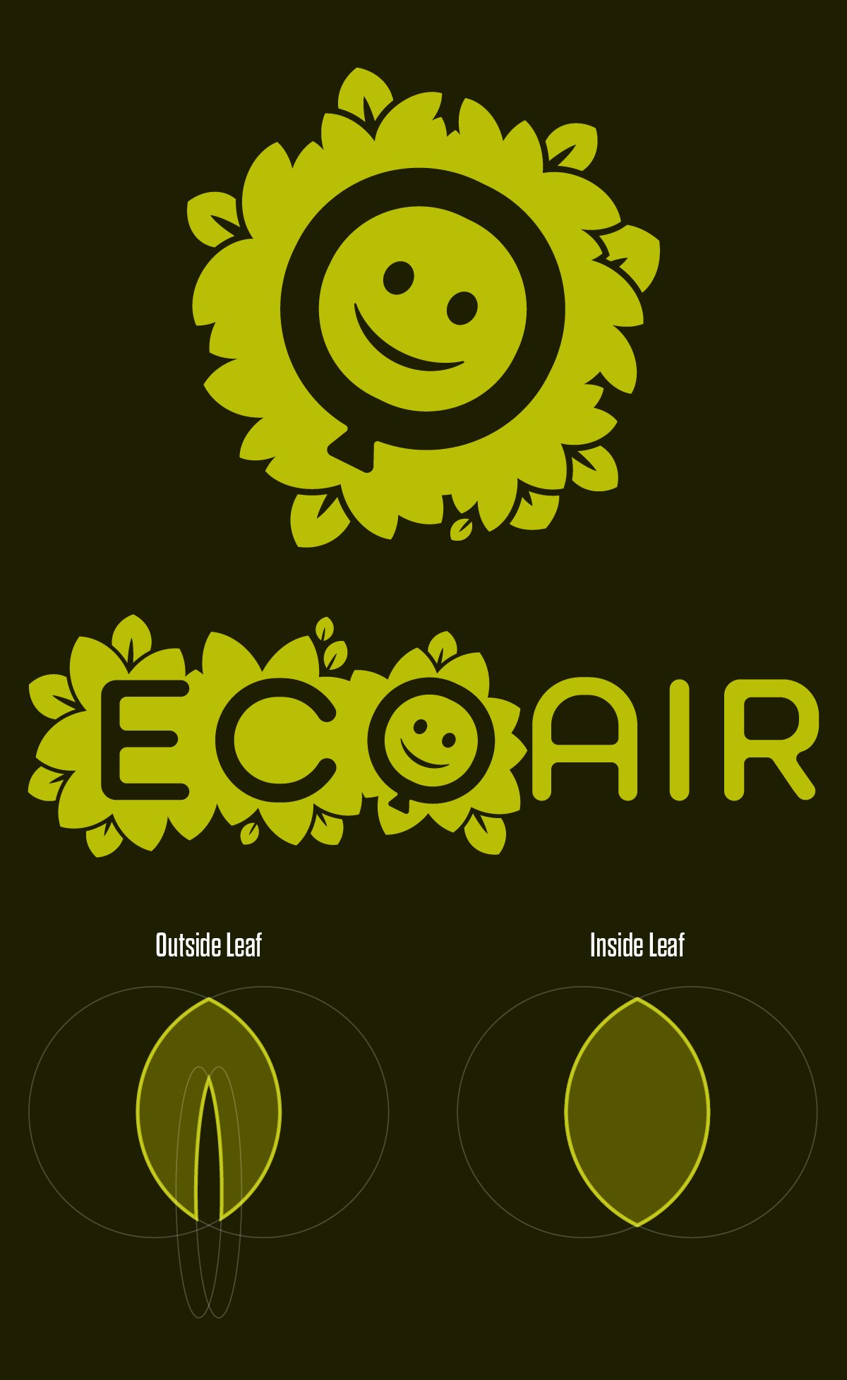
EcoAir Logo

The brief for this logo was to help portray the product’s two main qualities: its playfulness and eco-credentials. The client was particularly keen on including a smiley face and a balloon in the logo in some manner. I took that idea and ran with it, creating this logo of a smiley face in a balloon set against a leafy backdrop.
The leaves, in particular, became an important part of this brand as they would create a strong visual element that could be used repeatedly in future designs, with strong potential for animation.
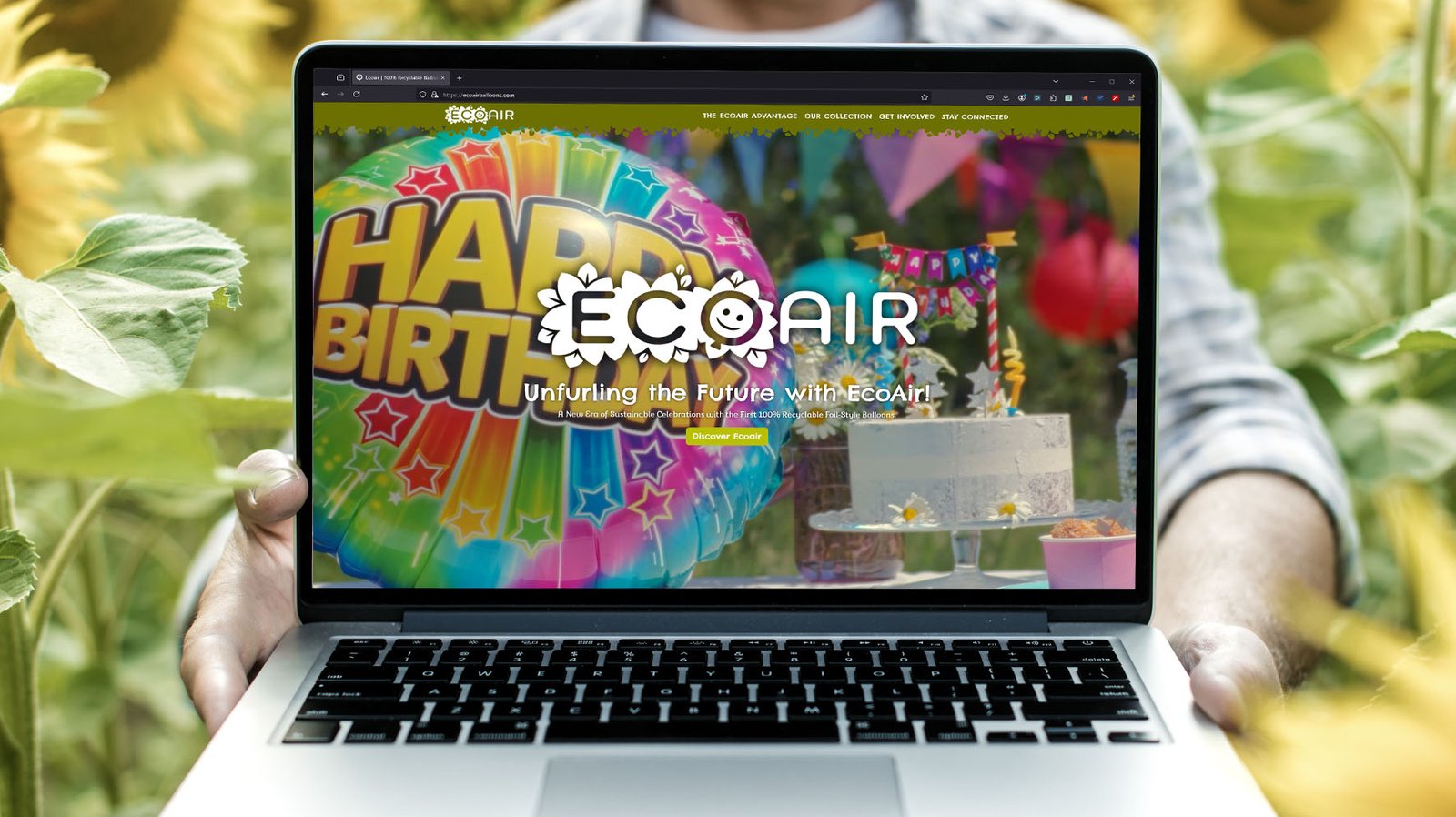
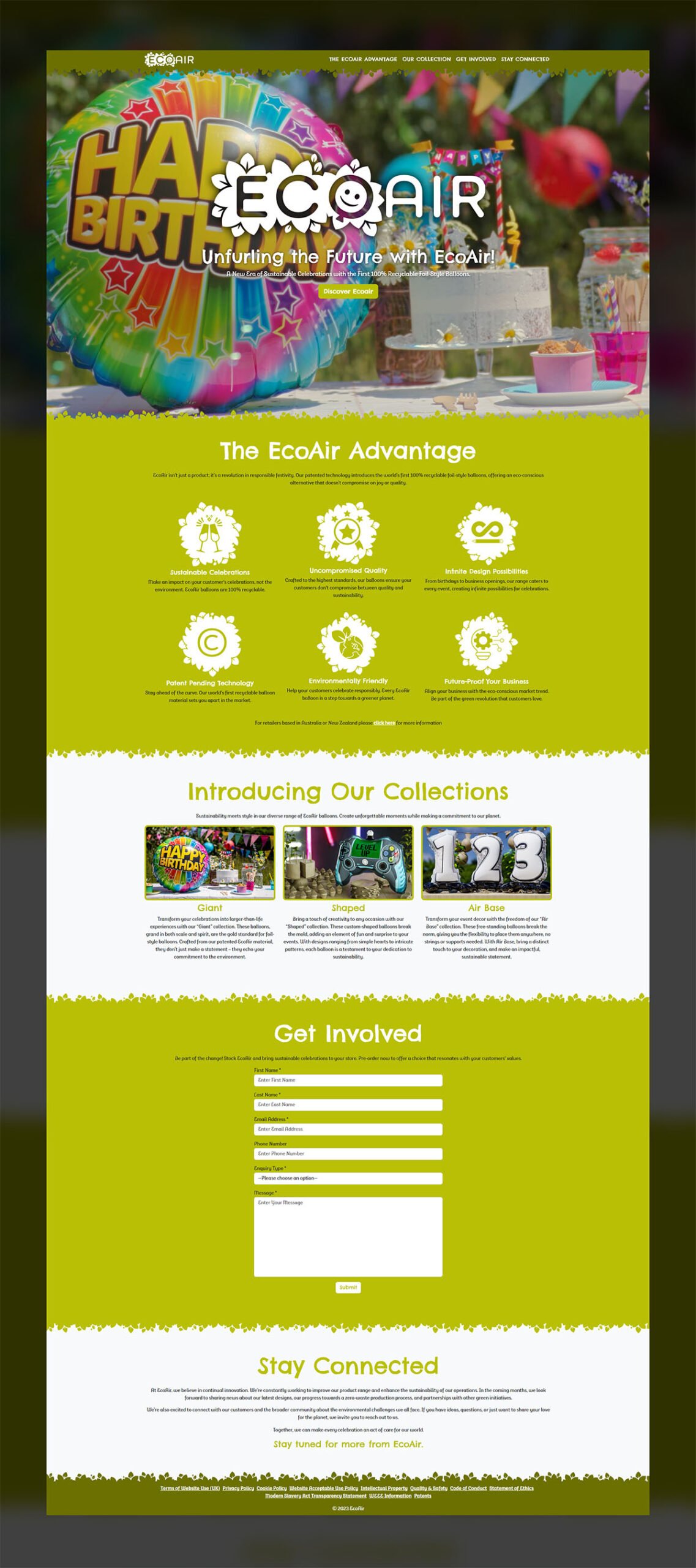
EcoAir Website

I used the leaves from the EcoAir logo to create a more playful/friendly aesthetic for this website that helped reinforce the brand. Combined with a full-page video background for the header section, this website focuses on a bright, minimalist design that supports the content and the overall brand guidelines of playfulness and environmental friendliness.
