
The logo was designed around the concept of plaster being applied to a wall, with the D and L letters formed by the plaster shape and a plasterer’s trowel integrated into the letter D. While the client chose blue as the primary brand colour, the logo was specifically designed so the shape could work independently of colour, allowing for adaptability across different applications. This flexibility ensures the brand isn’t limited to a single colour palette as the business evolves.
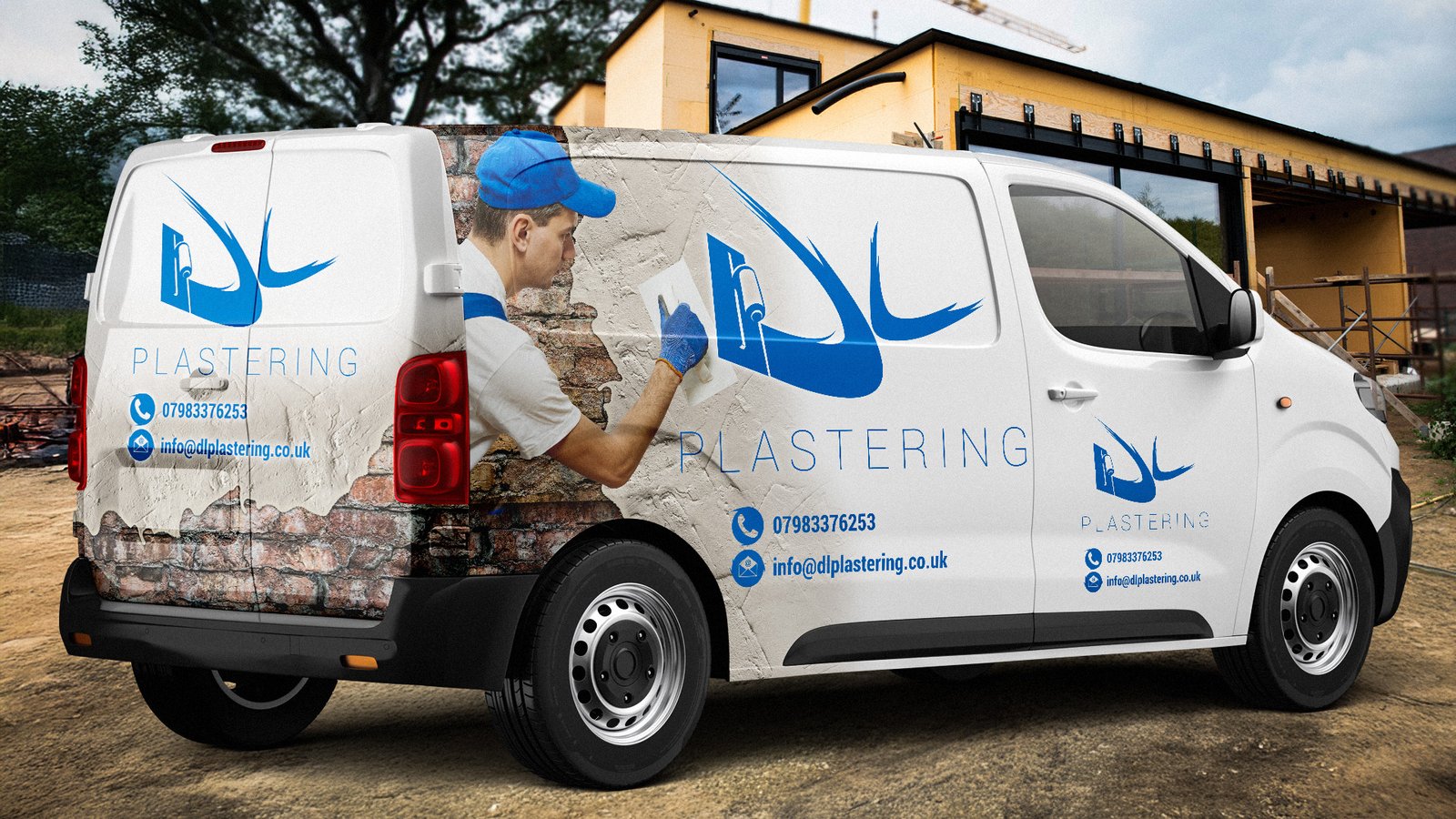
The business cards showcase the plaster-over-brick theme that became central to the brand’s visual identity. I incorporated this concept into supporting graphical elements to reinforce the company’s services, using it across business cards, van graphics, and future promotional materials. The business cards feature a spot UV effect on the brickwork texture, creating a subtle but tactile detail that helps the business stand out.
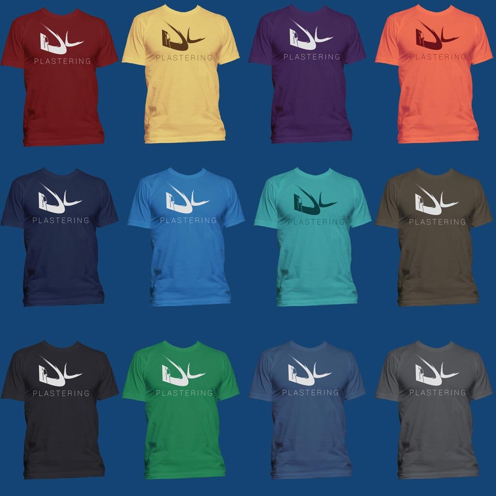
The t-shirt designs demonstrate the logo’s versatility and adaptability across different colour applications. As shown in the mockups below, the brand identity was designed to work effectively across a wide spectrum of colours while maintaining its visual impact and legibility. This flexibility allows the client to choose workwear colours based on practical considerations like dirt visibility, team preferences, or seasonal variations without compromising brand recognition.
This approach creates professional workwear that reinforces the brand identity, whether worn on-site or during client meetings, helping to build brand awareness and credibility in the local market.
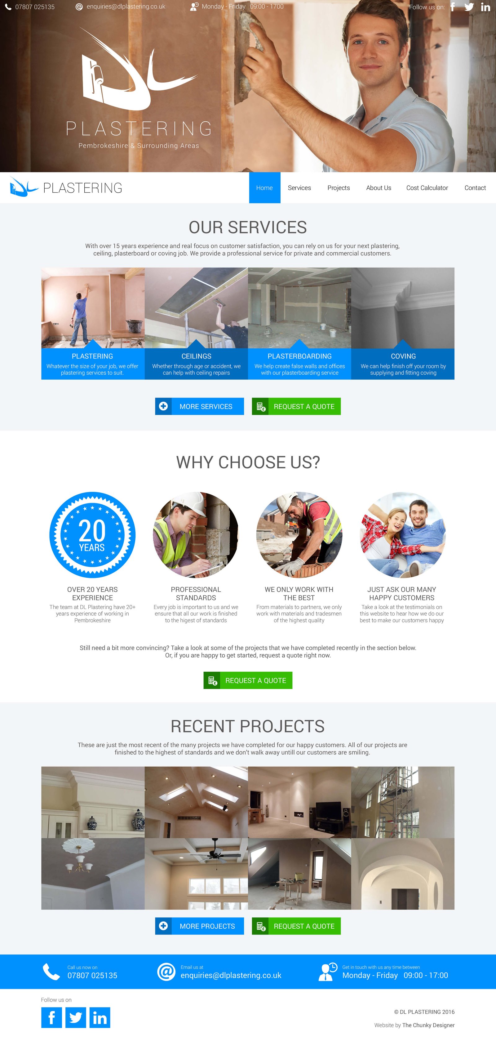
The custom WordPress website was designed to provide a professional online presence while serving as a practical business tool for DL Plastering. While the plaster-on-brick theme was prominent in other brand applications, the client opted for a cleaner, more minimal aesthetic for the website design. This decision created a professional online presence that appeals to a broader audience while maintaining the established blue colour palette for brand consistency.
The website features comprehensive service pages with detailed descriptions of plastering specialities, a portfolio gallery showcasing completed projects, and an about section that establishes credibility and trust with potential clients. The clean, professional layout ensures easy navigation while the responsive design works seamlessly across desktop and mobile devices.
The standout feature is the custom-built cost calculator, designed to streamline the quotation process for both the business and its customers. This interactive tool allows potential clients to input project specifications and receive instant preliminary estimates, reducing initial consultation time while providing immediate value to website visitors. The calculator was built from scratch specifically for the plastering industry, taking into account different room dimensions, ceiling types, and plastering requirements to deliver accurate cost projections.